
Fixing Wrong Totals in Power BI

If you haven't come up with the wrong totals in Power BI yet, you're either lucky or you have come up with them but nobody has noticed it including you, and in that case, you're still lucky. 


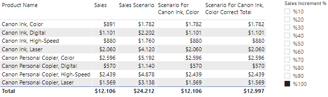
I have created a What If scenario to see how my sales would change, if my sales rise up to some specific percentage, for example, %100. If you don't know what is that or how to make scenario analysis you can watch DAX Fridays! #53: GENERATESERIES. Anyway, the first measure "Sales" shows the sum of sales. The second one shows the sales if, the sales rise up %100. And the measure of that is: 


Sales Scenario Value measure brings the selected percentage:


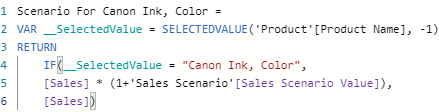
So far, everything works just fine. Here comes the measure for the third column:

In the third column, I want to apply a %100 sales increment scenario only for one product, called Canon Ink, Color, and see how that affects my total sales. For Canon Ink, Color, I apply the %100 increments on the sales scenario, and for the other columns, I want to see their real sales. As a result, in the third column, only the price for Canon Ink, Color doubled, others stay the same. But the problem is total. Despite the measure doubled the price for the selected product, it doesn't reflect that to the total line. Total line stays like there is no price change at the selected product. Why is this happening?  Because Power BI is not calculating the Total Line by iterating row by row the upper columns. That's why we need to find a way to force Power BI to do the calculation row by row. That means we need to calculate it by using an iterator function, not an aggregator. 


To be able to do that, I have used the SUMX function. Iterator functions need a table to iterate and I have virtually created the table to iterate row by row. To create a virtual table inside the measure, I have used the SUMMARIZE function which asks which column to group, and a measure to do the grouping. After creating the virtual table, I have used Scenario For Canon Ink, Color measure as the expression. 

For this situation, this method has worked. For your situation, it may not, and you might need a different solution. The thing to remember with wrong totals is somehow we need to find a way to force Power BI to do the calculation row by row, not by aggregating.

Comments

Popular posts from this blog

Manipulating Grand Totals with ISINSCOPE in Power BI

ISINSCOPE function was introduced in with November 2018 Power BI update. We can say it's a very young player in the game, but it's definitely magic. It can be used to manage lots of issues related to hierarchies, but in this post, I'm going to focus on manipulating the grand total line with it.  This is my budget forecast table. The budget forecast that you see for every month is not the forecast for every month, but it's the forecast for the whole year. The budget forecast for 2020 has changed every month. That's why we have different numbers for every row. Below you see the table visual with the year-month column and a measure that shows the values for every month. The thing that I want you to pay attention to is the total line. I wanted to see the last month's value for the total line and this is the measure for that.  This measure calculates this: If the year-month column has one value then take the average of that value. If it doesn't have one value, li...

How to Add Flags to Power BI Reports

Adding flags to Power BI Reports might be easier said than done. If you have a dataset which contains data of various countries, adding country flags looks cool. The process to do it, on the other hand, might be compelling. Now I am going to share with you the obstacles I  have faced during the process and of course, how I overcame them. First I made an excel list of countries that my dataset has. Then I have downloaded to my computer all the flags I need from Wikipedia and converted them to Base64 link via an image encoder website  base64-image.de  and added those links to my excel file, which looks like this: After I added my excel file to Power BI, I converted the data category of URL column from 'uncategorized' to 'image URL', which might be a small step for you but it's a big step for the success of the flag operation. Then I created one to many relationship with DimLocation table and chose 'both' as filter direction, so that I can filter from both t...

Customizing Themes With Advanced Elements in Power BI

Advanced Elements is not an intuitive description, that's why I'm going to show you what I'm talking about directly. For my recent project, I've decided to create my own theme for the report. When I was exploring Customize Theme tab, I have come up with the Advanced section. While text, visuals, page, and filter pane sections are self-explanatory, this advanced section seemed quite enigmatic to me. What are the first-level elements? Or the others? I think Microsoft agrees with me upon being enigmatic because the section comes with "Learn more" option: Click to  Learn More . But when I tried to learn more, it didn't make any sense to me, because I'm a visual person and those descriptions are quite hard to remember. That's why I have decided to be a good samaritan and visualize it, and then share it with you.  As you see, while the border is a third-level element, the shadow is a first-level element. Legend, x-axis, and y-axis are second-level elemen...